Apple is making its Shortcuts app simpler to use with iOS 17. The app, which allows power users to create automations for their favorite apps, will receive an updated user interface making it easier to find Shortcuts as well as the actions a given app can perform — something that’s known as App Intents. Plus, the Automation setup process in the Shortcuts app has also been redesigned to be easier to use, Apple told developers at its Worldwide Developer Conference.
The Shortcuts app has typically had a small but devoted following. The complexities involved with building automations have sometimes put its more advanced functions outside the reach of mainstream users. However, in recent years the app has been more widely adopted by those who wanted to create custom app icons to match their new iPhone Home Screen themes and widgets.
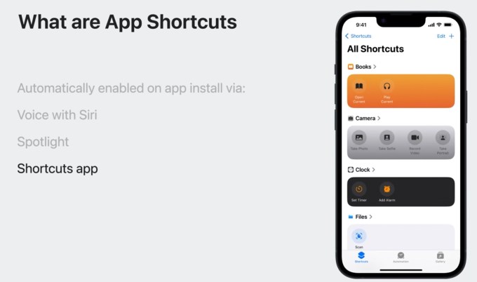
Now, Apple is hoping to make Shortcuts even more appealing to the everyday user in iOS 17 with a new design that now organizes your Shortcuts in featured rows so you can get started using them with minimal extra steps.
For example, in a photo of the updated Shortcuts app shared with TechCrunch by a WWDC developer attendee, you can see colorful rows featuring Shortcuts for Apple’s Books, Camera, Clock, and Files apps. Previously, a user’s shortcuts were displayed as small, colorful squares, but not organized by app as shown here. Apple told developers the new design will allow users to find their Shortcuts more easily, and it’s hard not to agree, based on this screenshot.

Image Credits: Apple
In addition, the redesign makes it easier to identify the actions associated with an app, and simplifies the process of creating automation.
In part, some of the changes coming to Shortcuts have to do with their now elevated spot in the iOS 17 user interface.
When searching for an app in Spotlight search, users will also be able to see common actions associated with that app, when Shortcuts are available. Developers can adopt colors that are associated with their app that will appear when their app is displayed in Spotlight on the Shortcuts app, plus they can use a thumbnail image for each entity instance.
On its iOS 17 preview site, Apple shows how its Photos app appears in Spotlight — with image thumbnails that point to specific albums, including “Recent,” “Favorites,” and “One year ago.” In a demo for developers, meanwhile, Apple showed the Reminders app with image thumbnails for specific entities in the app. These thumbnails appeared in green, orange and red, for “Assigned,” “Flagged,” and “Scheduled” reminders, respectively.
Plus, Apple made some subtle changes to Siri to make it easier to use spoken commands to trigger App Shortcuts. Where before, users would have to speak the exact phrase designated as the Shortcut’s trigger phrase, now they can speak more naturally. Even if the exact wording isn’t used, Siri will be able to understand the phrase as the Shortcut’s trigger, thanks to on-device machine learning that will allow similar phrases to also work. (A new tool, App Shortcuts Preview, will allow developers to test phrases that they think users might try with Siri to launch their app.) This feature won’t yet work on Apple Watch, though.
App Shortcuts will now work on HomePod, however, if the associated app is installed on a companion iOS or iPadOS device.

Image Credits: Apple
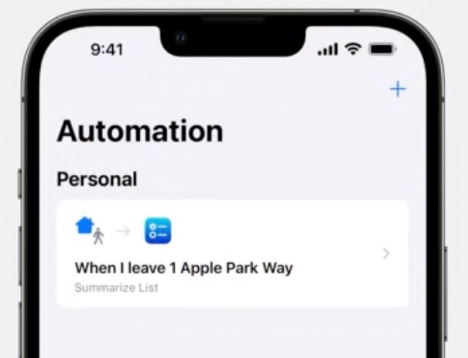
The Automation setup process was also improved, but as this is more of a consumer-facing feature, Apple didn’t get into much detail about the redesign here in its developer session. We will be looking to go more hands-on with these features when the public betas emerge in around a month.
Apple redesigns its Shortcuts app in iOS 17 to be easier to use by Sarah Perez originally published on TechCrunch
from https://ift.tt/YJE6IrZ
via Technews


No comments:
Post a Comment